I’m not suggesting that the vaccine is useless against Delta. The Israeli and UK data both show it’s still quite helpful – although getting the second dose after 3 weeks, instead of waiting longer, probably kneecapped it some. But there was already tons of data out there for how useful the vaccine was pre-Delta. We hardly needed a new article on that. And the NYT article was deceptive in suggesting it gave data relevant to “how cautious should I be today?”.
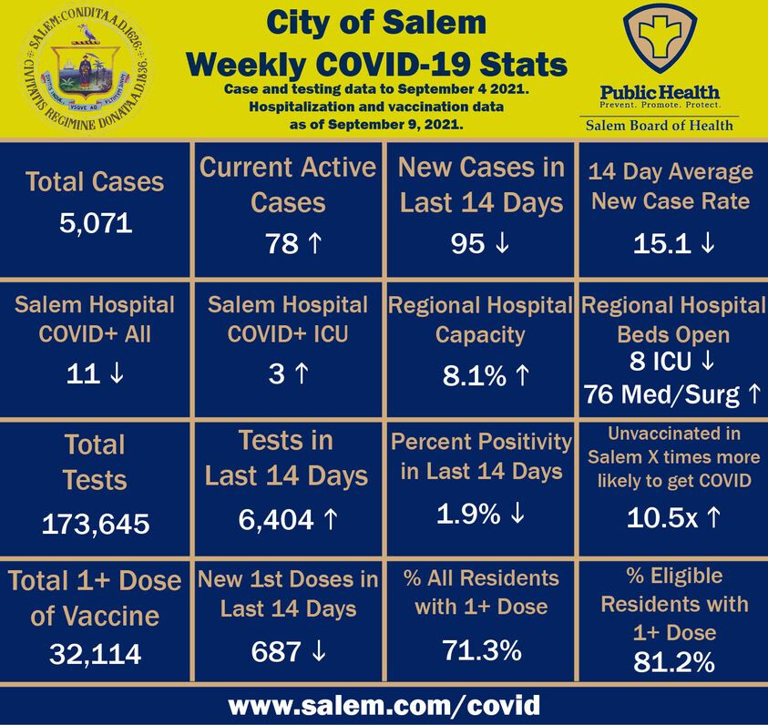
The city I live in published a weekly COVID scorecard, and recently they had been publishing the “breakthrough %” on the scorecard, which obviously was drifting up over time because more people are getting vaxxed. I sent a note to the mayor’s chief of staff that suggested they replace it with something more meaningful like relative risk rate, because breakthrough rate is just going to keep going up and it scares people.
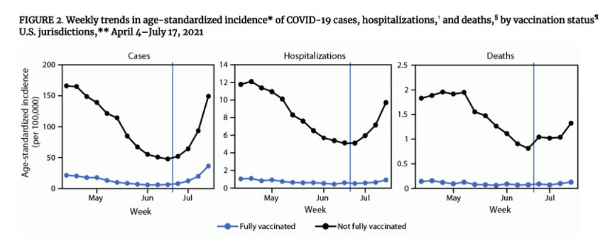
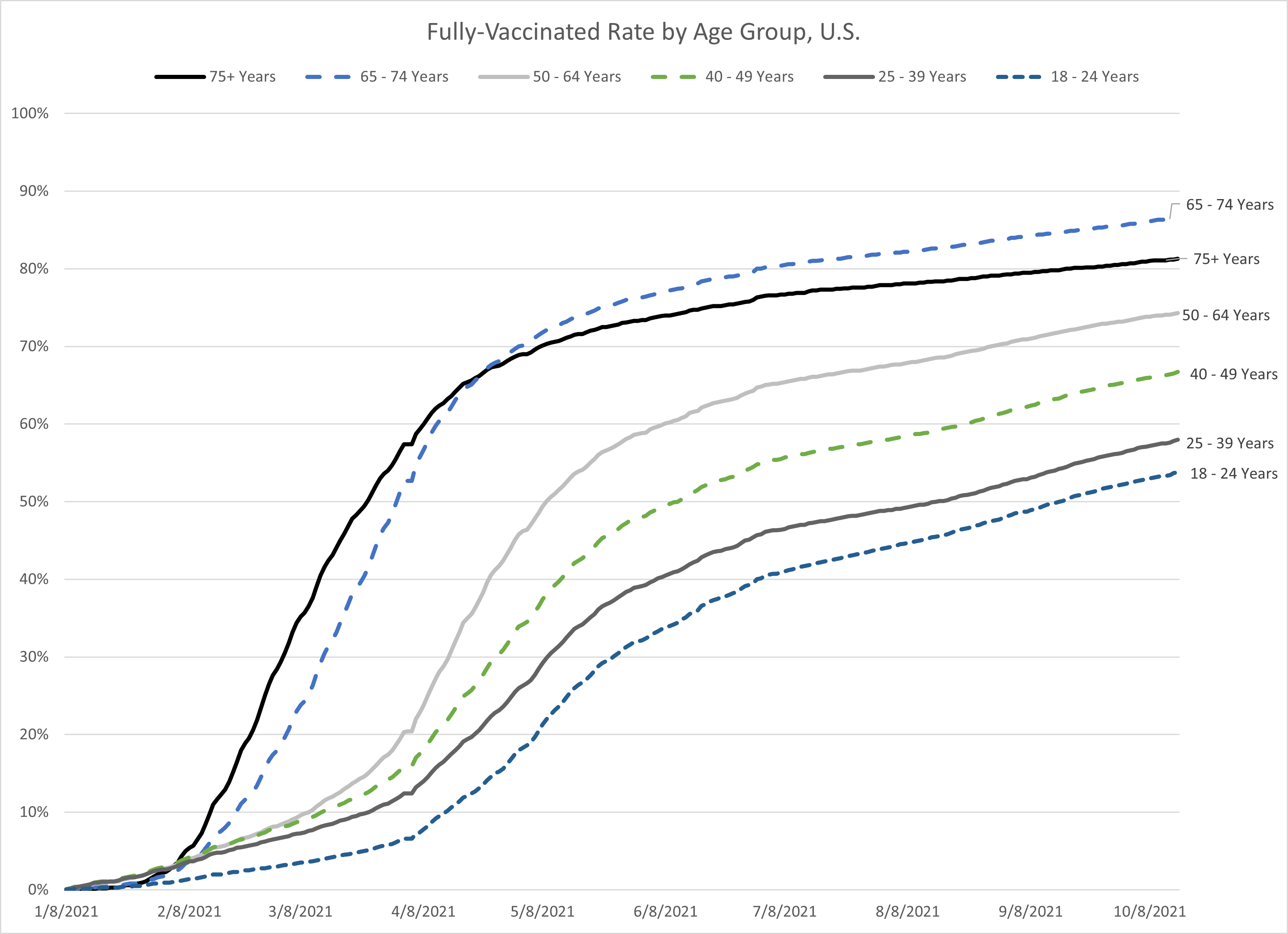
It took me a while to understand that the “VE” curves are “vaccine effectiveness”, and so what the graphs are showing is continued high vaccine effectiveness, even against Delta. Less for cases (maybe only 80% effective) but 90-95% effectiveness against hospitalization or death in most age groups, even now.
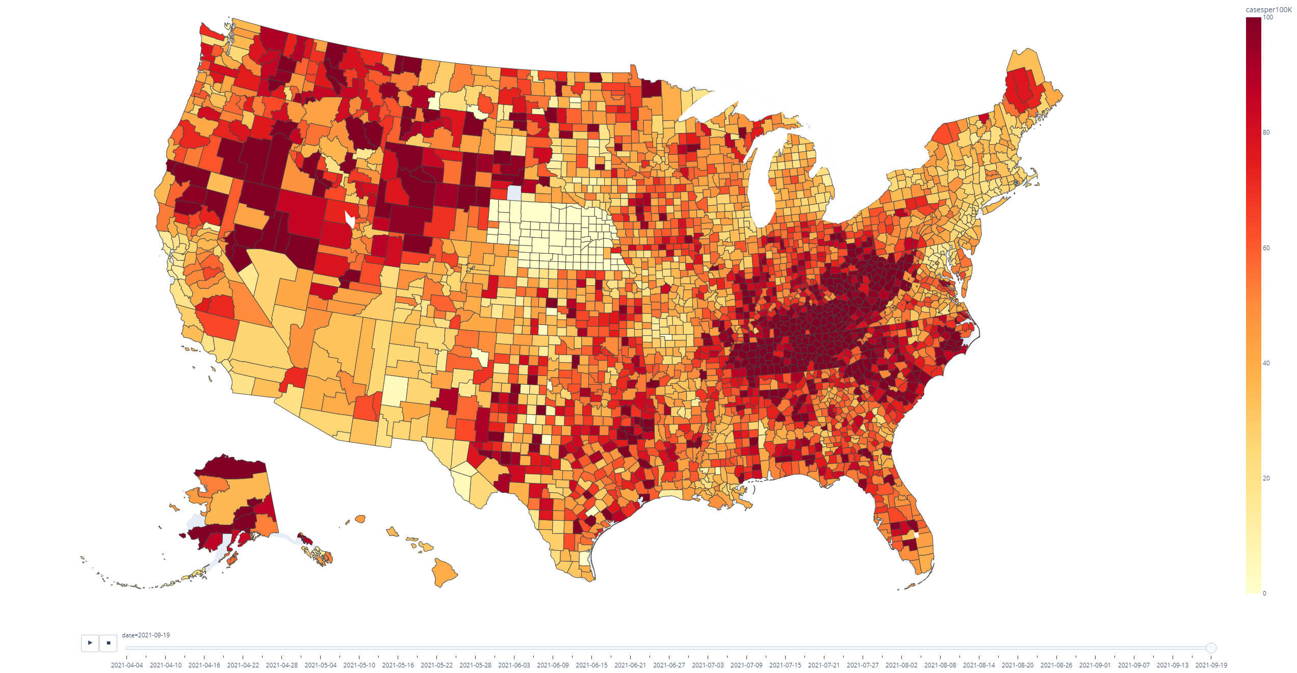
You can’t “see” important places like NYC, because they’re geographically small. Even though that was the epicenter of the first major wave of COVID in the U.S.
It does help in seeing the geographic spread, especially in the third major wave (fall/winter 2020-2021) – but of course, most of the northern midwest where you saw the winter wave first has very little population, as opposed to the very dense east coast.
It’s okay to have right-censored data (after all, you have to stop the study at some point), but … well, let’s let them explain what the problem was:
In order to get accurate estimates, we need a sufficiently long time period after someone has been infected to be able to monitor their symptoms and observe when their symptoms came to an end. When we published our estimates in April, the cut-off date for assessing if people still had symptoms was 6 March 2021, just as the UK was emerging from the “second wave” of infections. This meant that lots of people in our sample had recently been infected and had only a limited period over which to assess average symptom duration, with most study participants having less than 12 weeks of follow-up data. Over 50% of participants were thought to have ongoing symptoms at that point. However, now that we have data that extends well beyond 12 weeks after infection for most participants in the sample, we can see that symptoms have since stopped for the majority of those symptomatic on 6 March.
Going from 50% to about 8% of people having continuing symptoms is a huge difference.