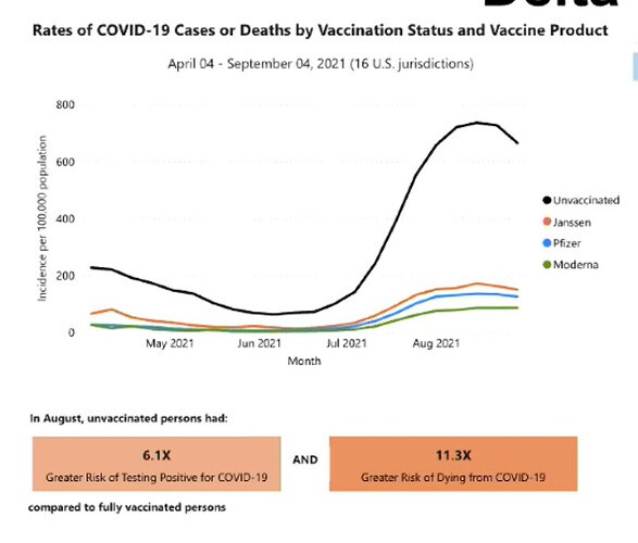
ooh, broken down by vaccine type
Where are the “partially vaccinated?” Excluded from this chart or lumped in with unvaccinated?
IIRC, UK data breaks out multiple categories (unvaxed, one jab, <2 weeks post 2nd, fully vaxxed).
link?
It was in the Livestream this morning, and after they edit the captions they’ll post it with the other completed lectures, at the link i gave above. (Click on the word “audit”.)
I don’t know if she said (since i watched the live stream about an hour after it took place, and they pulled it down when i was about halfway through.) But one disadvantage of lectures, as compared to formally published slides, is that the documentation is often a little lacking. I wondered that, too.
I saw these graphs floating around the tweeters a couple days ago. I’ll see if I can find them…
Ah, it’s tough to see links on this site if you do the hyperlink thingie instead of just pasting the URL so we can see it
As in, the color of linked text is barely different from non-linked text
So here is the YouTube playlist of the recordings of the livestreams. I see today’s is not up yet, but I’m sure it will be there in a day or two.
This is the course page:
It depends on which theme you use. In “light” I find them pretty visible. I think the “shades of blue” theme makes it hard to see anything color-based.
Ah, let me switch my theme then.
Yep, definitely easier to see now – thanks!
Summary
What is already known about this topic?
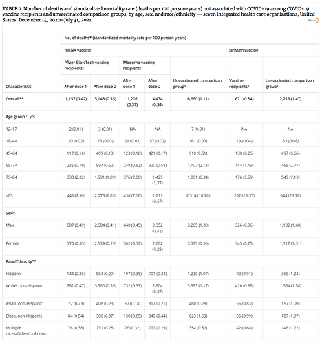
Although deaths after COVID-19 vaccination have been reported to the Vaccine Adverse Events Reporting System, few studies have been conducted to evaluate mortality not associated with COVID-19 among vaccinated and unvaccinated groups.
What is added by this report?
During December 2020–July 2021, COVID-19 vaccine recipients had lower rates of non–COVID-19 mortality than did unvaccinated persons after adjusting for age, sex, race and ethnicity, and study site.
What are the implications for public health practice?
There is no increased risk for mortality among COVID-19 vaccine recipients. This finding reinforces the safety profile of currently approved COVID-19 vaccines in the United States. All persons aged ≥12 years should receive a COVID-19 vaccine.
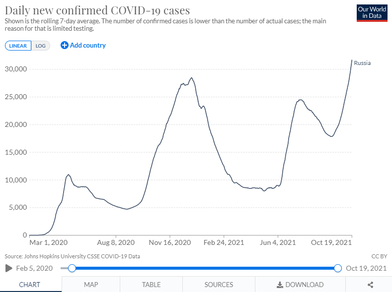
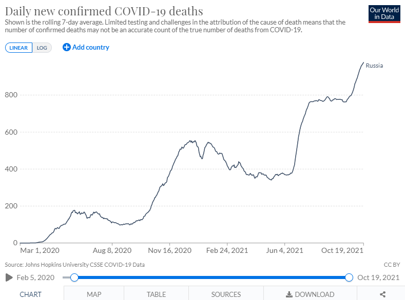
time to make some graphs…
Interesting. What are the conclusions?
- people who get vaccines are a healthier subset of the population or
- covid morality is going undetected through other causes or
- ??? Maybe a combination of 1&2???
That’s interesting. So… maybe people who get vaccinated have better access to healthcare, or are more risk averse, or are just more privileged people.
Have you ever looked at mortality rates by income? The differences are really striking.
Well, generally it’s not really mortality rates by income, but by zip code/county/census tract. And yes, I was on the POG for one of the SOA studies on that.
There is an issue of people usually die when they’re pretty old, and haven’t been working for income in some time, and generally they fall down income quintiles in retirement, but are relatively high for their age group. Whatever made them high-income in their working years should probably have effects when they’re old. So you have to grab that.
In the studies I’ve seen, they don’t solely select on income, because high income blue-collar generally doesn’t have as good mortality as high income white-collar employees. So they have something like “socioeconomic factors”, heavily weighted toward amount of income someone has completed.
In any case, take a look at where, specifically, the data came from to make the comparison. They do note what they did not control for:
The findings in this report are subject to at least four limitations. First, the study was observational, and individual-level confounders that were not adjusted for might affect mortality risk, including baseline health status, underlying conditions, health care utilization, and socioeconomic status. Second, healthy vaccinee effects were found in all but the youngest age group. Such effects were also found in a cohort study conducted in a nursing home population, which reported substantially lower aRRs for 7-day mortality among vaccinated residents after dose 1 (0.34) and dose 2 (0.49) as compared with unvaccinated residents ( 5 ). Lower rates of non–COVID-19 mortality in vaccinated groups suggest that COVID-19 vaccinees are inherently healthier or engage in fewer risk behaviors ( 7 , 8 ); future analyses will address these issues. Third, although deaths associated with COVID-19 were excluded, causes of death were not assessed. It is possible that the algorithm used might have misclassified some deaths associated with COVID-19 because of lack of testing or because individual mortality reviews were not conducted. Finally, the findings might not be applicable to the general population. The VSD includes approximately 3% of the U.S. population, and is representative of the general population with regard to several demographic and socioeconomic characteristics ( 9 ). Other studies have already demonstrated the safety of COVID-19 vaccines authorized in the United States.
The main thing they were trying to demonstrate was that the vaccines don’t kill you, essentially.
But yeah, it may be that sick people haven’t been getting the vaccines, especially old, sick people, who may have issues even w/ getting flu shots.
I found the same charts in a nyt article. And the article says that the partially vaccinated were excluded, and all data was age-adjusted in the “total” graphs, so the effects of age don’t muddy the rest of the data.
Who Had Covid-19 Vaccine Breakthrough Cases?
Q: I want to show three things, but my tendency is to use a bar graph that only shows two. How to do?
I.e. a 100k permanent with premiums of 100 for life, plus 400k term 20 with premiums of 40 for 20 years then ceasing.
So I want to show premiums of 140 and coverage of 500 for 20 years then premiums of 100 and coverage of 100 for remaining lifetime.
Best I can do is coverage vs age, with premiums types into the individual bars. But then we lose scale of premiums.
Audience are consumers.
I can’t follow this. Can you maybe use some more words?
Layer 1: $100k of coverage for life, $100/month premium.
Layer 2: $400k of coverage for 20 years, $40/month premium.
So I want to show $500k of total coverage (consisting of $100k+$400k) with premiums of $140/month, for the first 20 years.
Then years 20+, drop the 400k layer and just left with the base layer of $100k at $100.
So I can do a bar graph with two stacked bars, one of $100k and one of $400k out 20 years, then the $400k bar stopping. But that doesn’t show premium reduction very well.
_____________ (400k at $40)
______________________________________________(100k at $100)
Y axis coverage amount (so at the top it would be 500k) and X axis age/years.
I’d probably do a chart. But let me think about graphing that.
How would you ordinarily show premium and benefit on the same graph?
I wouldnt really this is a one up for a variety of somewhat complex options.


