Greetings Programs!
Do you guys have any preferred visualizations to show claims severities? In R studio in particular.
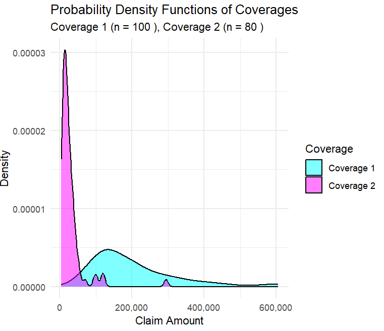
So far, my favorites are geom_boxplot() (from ggplot2 library) which can shows a standard box and whisker plot , and geom_density_ridges_gradient() which is a function of the ggridges library, and is kinda looking at the same data of the box whisker plot, but from the side rather than from above.
The challenge with geom_density_ridges_gradient() , is that i can compare two coverages or perils in the same visualization, and while I can get the differences in concentrations of claim severities, i don’t have a way to show which has more.
So the question is this, do any of you have favorite R visualizations that can show between 2+ coverages/perils what the distribution of claims is AND how many claims you are getting.
Like an exhibit that shows both that BI claims have higher concentrations at like 50k and medpay claims have concentrations around 2k, AND that there are like 10X BI claims compared to medpay claims?
Till all are one,
Epistemus