…said Knoath bluntly
1 Like
Thanks Alec Stapp for the heads up!
https://x.com/AlecStapp/status/1914426556182638891


Given how these look, I assume one person is to blame for these
lucky for them, their name isn’t on them
1 Like
As an actuary I also hate them, but to be fair, there is definitely a target audience that would eat this up.
So yes, I do look at r/dataisugly, but usually don’t grab from there… (because I feel like it’s almost cheating) - I’m usually taking something I come across “in the wild”
but GOOD LORD

Saw it here:
https://www.reddit.com/r/dataisugly/comments/1kd0bsj/this_hideous_area_chart_on_wikipedias_article_for/
and then had to go look:
yes, it’s there
2 Likes

Also, I’ve got good eye sight ant a 24" monitor and I’m struggling with that 3 point font or whatever it is. :squint:
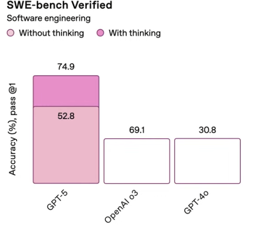
Gpt-5 came out today… This is possibly the most important slide of the most anticipated tech of the year.
3 Likes
Conclusion - its better. Right?
We should probably speak favorably about our future Dear Leader.
obviously drawn by AI
Pretty terrible.
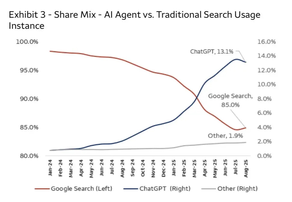
And when Google forces an AI search result to the top, where does that go on this chart?
2 Likes