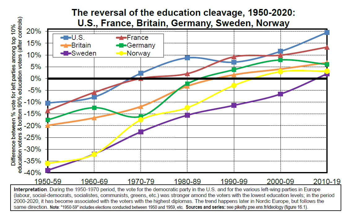
Here’s a recent one from pickety-eee-eee-eeee.
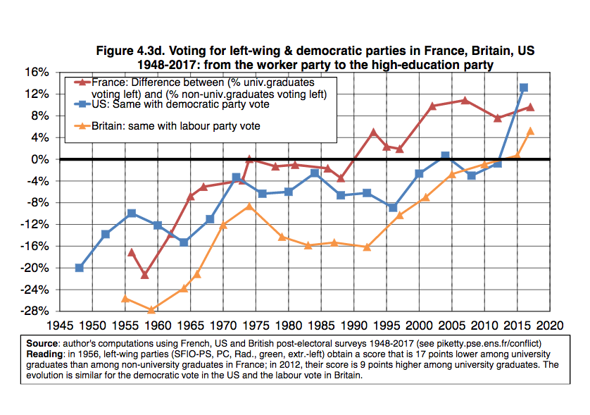
Basically, the left/right re-alignment on education is 50 years in the making, and cross-continental.
Here’s a recent one from pickety-eee-eee-eeee.
Basically, the left/right re-alignment on education is 50 years in the making, and cross-continental.
Jeez, what ugly design
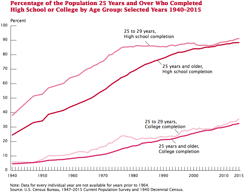
Also, might be useful to track what percentage of voting population is univ/non-U grads. I assume that’s in a different figure
Yes of course way more people are college educated and beyond. Enough so, that the in the 70s, education was probably less of a coalition and more of a correlation to wealth.
Here’s another look, using percentiles.
So it went from about 10% in 1970 to about 35% in 2018.
I wouldn’t assume 1970s non-university people were “working class”. Most of them were “middle class” like my grandparents…
Only one of my grandparents had a college degree, and she didn’t get it until her 40s, because it was required to be a special education teacher. But my maternal grandpa was a manager for IBM, and my paternal grandpa was a forester for Georgia Pacific. Maybe Granddaddy was working class, because he actually had to wade into the swamp.
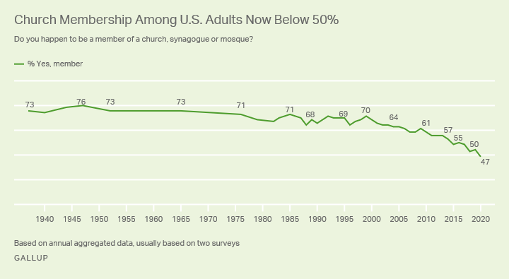
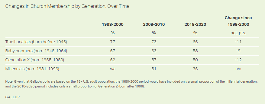
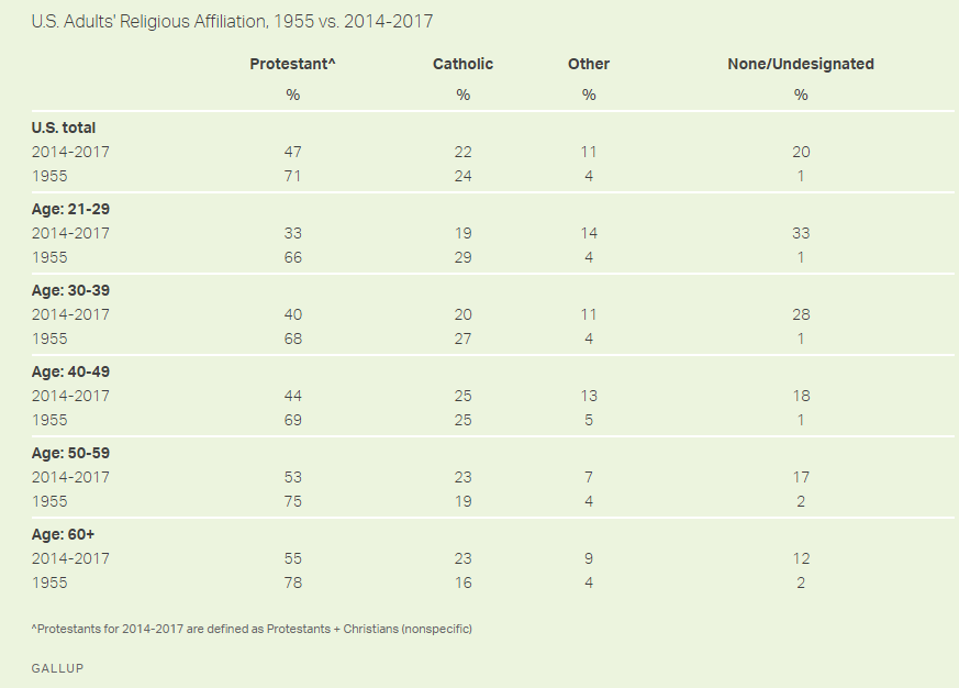
People are quitting. The churches are will have to downsize. Though they will always have some membership. The actuary in me has another question-- what sort of people are leaving the churches, and what sort of people are remaining? Volume is dropping, but what about Mix?
Hopefully, the remaining membership will be the true believers, the people who choose to be a Christian even when it’s unpopular. But what if it’s the opposite. The believers leave and tribes remain.