A friend shared this because of the content of the article, not the shit-tastic dataviz
Here y’all go – orange pie chart. ALL ORANGE for ALL SLICES

WHAT IS THIS
A friend shared this because of the content of the article, not the shit-tastic dataviz
Here y’all go – orange pie chart. ALL ORANGE for ALL SLICES
WHAT IS THIS
Okay, it would have been funny if they had done a legend to the right
Who sponsored that, ING?
I was going to ask, is the author from the Netherlands?
Colorblind friendly?
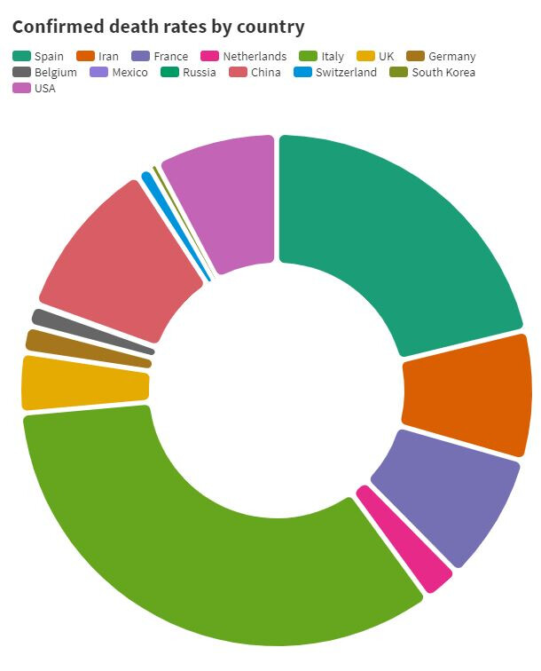
But this one’s a donut!
At least it’s not a cronut.
DAMMIT YELLEN
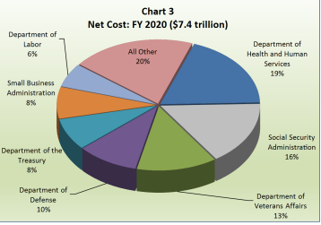
3D pie chart, ffs
Source:
Okay, to bitch:
I hate pretty much all 3D static dataviz, but I especially hate 3D pie charts
AND THEY’RE USING THE FRICKIN DEFAULT COLORS IN EXCEL
OLD EXCEL
WITH GRADIENT FILL BACKGROUND
AAAAAAAAAAAAAAAAAAAAAAAAAAA